Dieses Blog durchsuchen

Freitag, 5. November 2010

Eradius Fontdesign

During the third semester, everyone had to create his own font. I got the inspration
from the design of the panton chair. 
At the beginning, it is hard to get the right feeling about the space between the letters or the kerning. I wanted to create constructed fonts, based on several forms being able to be put together like legostones. The font exists in light, condensed, regular, bold and black.


Character design Family

With different tools in character design, like blind drawing, you can find very new forms, new personalities and give them a life, a story and a name.
The idea of making a kind of patchworkfamily stood at the beginning of my work. The form of my characters came by using blind drawing and the alchemy program. With this tool, I detected new things,  I never imagined before. I colored my family in  digital painting technic with a wacomboard.


Donnerstag, 4. November 2010

Bangkok Unruhen 2010

This little booklet is a result of research about the civil commotions in Bangkok this year.
It was my personal choice to do this booklet. 
Due to my vacation in Thailand in summer 2010, I had a special interest in following the news. My booklet is a summary of the happenings with an informing part at the beginning. With little icons you can easily know what has happend. The red color is dominating due to the red shirts in Bangkok. This book can give you an idea of the background of Thailand, its political situation and how this civil commotions happened.


CD Theater Trier Spielzeit 2010/11

This voluntary scheme was the first one in a cultural background. The theatre in Trier is a quite small one, based on his tradition, and proud of their many customers.
The actuel logotype doesn‘t convince to any one, neither customer nor to the theater themselves. I made a research about the town and the theater background. Trier is an old roman city, with an amphitheater and lots of epigraphes in stones. I found that they often used ligatures to get a perfect letter image. Using this same tool in my CD was sure. With this way I could combinate the city with the theater in a classic way without losing a modern touch.


Dienstag, 2. November 2010

CD für den FB Modedesign Trier

I really enjoyed doing this project. It was  very interesting to have a look at the fashion design students and their fascinated works.
I wanted to develop a little booklet with a special binding. I chose an accordion fold. This allows readers to tear pages open to reveal photos of fashion shows. The collection created by our students is very new and expressive like the logotype I designed. 


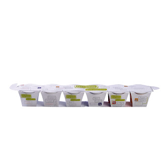
frulala fruit concentrat

This product is a new invention and doesn‘t exist like this in any supermarket in Germany.
The difficulty consisted in developing a new packaging form and a design.
The form of the packaging and the brand name research have been developed together with other students in class. This product has to be mixed with a second good to enjoy it. The design must inform the customer about the use of the product.


4711 creativ challenge


This challenge consisted in creating something new to regain the success of the old days of the traditional german parfum brand. There were neither limit or preset rules. I wanted to develop a second new product which contains some ingredients from the parfum. The combination of chocolate with herbes is nowadays very successful. I combinated the main ingredients, seperated them to finally mix them with different sorts of chocolate. 
The result was chocolate pralines in a quite luxury packaging. In buying this good, you first eat chocolate and then make a link to the main brand 4711. Perhaps the idea of buying the parfum isn‘t so far away any more.